Over 1 billion people worldwide live with disabilities or impairments today. But unfortunately many digital services and applications are not designed with everyone in mind. And many of these people still struggle to independently navigate the digital world. It’s because of this that digital accessibility is essential to building an inclusive society, one where everyone can thrive.
Insights on digital inclusion
We strive to make sure the digital things we design, create and use everyday are built for everyone. In this post the team share their insights on digital accessibility. They’ll touch on valuable resources, experiences and lessons learned over their careers.
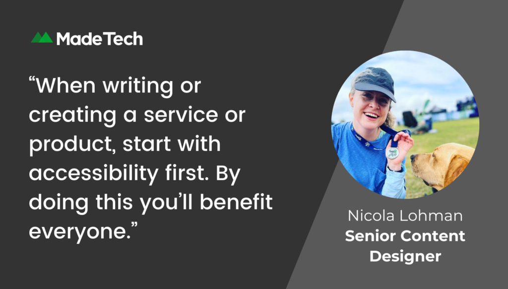
Think accessibility first – Nicola Lohman, Senior Content Designer
By making things accessible for people with disabilities, everyone benefits. Did you know that 16 million people in the UK have a disability? But crucially this number doesn’t include people who may be disabled temporarily or disabled based on their situation.
This is explained best in the Microsoft inclusive design kit. For example a person with one arm has a permanent disability. A person with a broken arm has a temporary disability. A new parent carrying a baby has a situational disability. This means that all 3 of these people would have the same needs when using a product or a service – so everyone would benefit from the same solution.
At some point, even if we don’t have a permanent disability, everyone has benefitted from the same solutions used to help those that do. Common examples include the dipped curbs on pavements and automatic doors.
But it’s not just physical disabilities that affect the way a person interacts with products and services. People who are neurodivergent can also need alternative solutions. For example those who are autistic, have ADHD or are dyslexic may have difficulty reading information because of things like:
- jargon
- complex language
- a difficult to follow layout
- large paragraphs of text
- pop up boxes
- unnecessary images
By using these things in your digital content you make it harder for someone to read and understand the information. This is called cognitive overload. By avoiding using these things, you’re also helping people who may be:
- stressed
- in a hurry
- grieving
- distracted
And we’ve all been one of those things at some point in our lives. So when you’re writing or creating a service or product, remember to start with accessibility first. By doing this you’ll benefit everyone whether they have a disability or not.
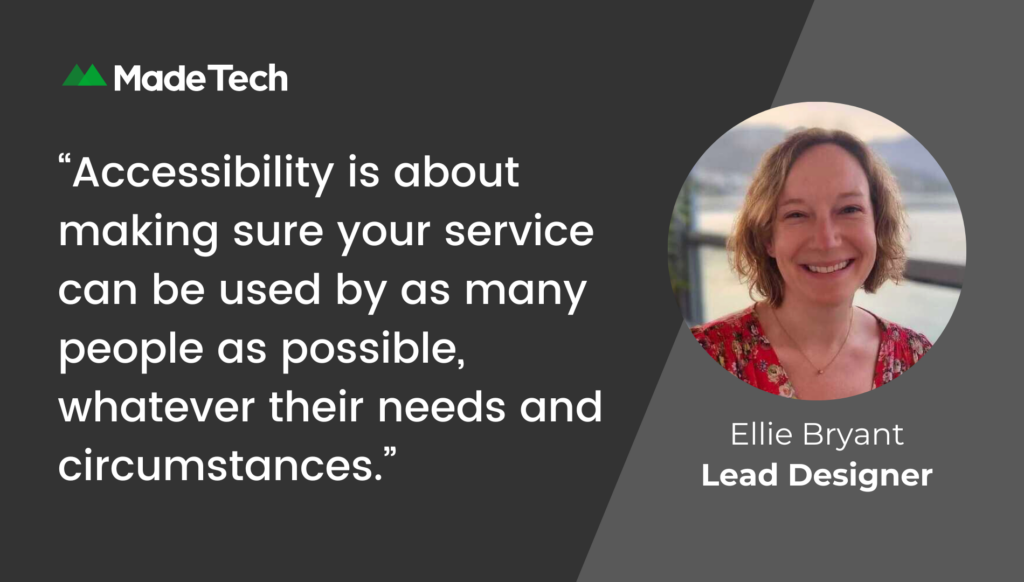
Universal Barriers as a framework for accessibility – Ellie Bryant, Lead Service Designer
Accessibility is crucial when designing services. But especially so for government services as users don’t have the option to use a different, more accessible alternative.
It’s then no surprise that accessibility has come up as a consideration on all of the projects I’ve worked on at Made Tech. However, in my experience it’s often viewed as the domain of the interaction designer (despite being everyone’s responsibility). It is also usually only considered in the context of digital, screen-based accessibility.
Until last year, I wondered how I, as a service designer, should best be ensuring accessibility in my work. Then I stumbled across the idea of Universal Barriers, a way of considering accessibility in a broader service context.
I was introduced to the idea as part of Services Week 2023. Which is a great annual event with loads of free online talks about all sorts of aspects of government services. Folks from the Central Digital and Data Office (CDDO) shared their thinking around the Universal Barriers.
Universal Barriers are a framework of 11 barriers to accessing services. It’s used to make sure services are fully inclusive for all users. And includes situations beyond understood areas of web accessibility and assisted digital support. The 11 barriers the framework explores in detail include:
- awareness: knowing that a service or aspect of a service exists at all, for example, a phone line to call for help
- enthusiasm: trying something new, asking for help or agreeing to a request
- access: to the resources that a user may need to use a service, such as a printer, computer, photo booth or witness etc
- time: to participate in the service, for example to gather information, fill in a form, wait for a web page to load or travel to an appointment etc
- finance: the financial resources to afford using the service, whether that’s a a reliable internet connection or a bus to travel to a service
- evidence: the ability to provide the evidence needed to use a service such as a bank statement, photo ID or proof of address
- interface and interaction: the skills needed to use the interface or carry out the interactions involved in the service. This can include the ability to use a computer, talk face to face or handwriting ability etc
- comprehension skills: being able to understand written content, a website, form or signage used in a service
- self-confidence: users having the belief in their ability to understand the process or complete tasks
- emotional state: feeling psychologically strong enough to use the service
- trust: having the confidence that the people and technology involved in the service will be secure and reliable
What many people think of as accessibility (digital and web-based) would come under the ‘access’ barrier. But this framework goes way beyond that, considering all sorts of other barriers to accessing a service too.
A couple of great examples of Universal Barriers put into practice were shared during CDDO’s session at Services Week. They included the Ministry of Justice’s work for their HM Courts & Tribunals Service. I’ve also come across the Department for Education using Universal Barriers in their early years education work. Some suggestions for applying it in practice include using Universal Barriers to:
- inform research recruitment
- create discussion guides
- guide analysis of research insights and opportunities
- review a service and identify opportunities for improvement
I haven’t had the opportunity to apply Universal Barriers in my work yet. But it’s a really powerful way to build accessibility into more than just the digital screens of a service.
Accessibility is about making sure your service can be used by as many people as possible, whatever their needs and circumstances. And that extends beyond the interface design to all the other interactions that make up a service too.
For more information on Universal Barriers, you can:
- read about understanding all the barriers service users might face
- read Ute Schuberger’s piece which formed the basis of CCDO’s Universal Barriers framework
- join the cross-gov slack Universal Barriers channel: universal-barriers-community
Advancing accessibility in government digital services – Mieka Webber, Senior User Researcher
Digital technology is reshaping our daily lives. The importance of creating accessible services cannot be overstated. Making sure that all users can access and use digital services promotes inclusivity and equal access to information.
The UK government recognises the significance of digital services. It allocates substantial funding each year to improve and enhance its digital products. Part of this is following digital design standards and promoting WCAG guidelines and checklists.
The great news is, there are lots of tools and public libraries available to streamline the design and development process. These standards are a valuable resource for creating accessible, public facing digital services. It’s worth noting that these mainly involve document reading, signing or online applications.
We do sometimes come up against challenges when working on internal systems and services. This is often tailored for employees rather than the general public. These systems require more advanced user interactions and complex data structures. For example, users may need the ability to view, sort, filter or edit data tables based on specific permissions. And each user has to have a unique subset of data or restricted permissions for enhanced data security.
In examples like this, existing custom libraries may not always meet our needs. And so we focus on innovative solutions to make sure users, including those with access needs, can complete their tasks. A good example here is introducing visual indicators within dropdown menus to signify when a task is complete. There’s also the option to optimise screen responsiveness, this can support users who need access to multiple systems at once on a single screen. These are just some of the solutions we’ve used to enhance the user experience and improve accessibility to internal systems. And this is where research and automated accessibility testing (using tools like Axe) become vital.
Creating accessible services for government is especially important. Particularly when it comes to developing internal systems that support employment opportunities. We must prioritise the integration of accessibility and good design practices. This way we can build on established standards to create innovative solutions that cater to the diverse needs of all types of users.
Commitment to inclusivity and accessibility drives my work. It’s an essential part of making sure that our services meet the needs of all individuals, now and in the future.
If you’d like to read some more on this topic, we previously posted a handy blog post full to the brim with useful accessibility resources and tips. And if you’re interested, you can also find out more about user-centred design.


