We’re proud to be working with the Met Office helping to give people the weather information they need. Most of us are familiar with their weather forecasts, but fewer people know about their specialist forecasts. These provide particular information that is not shown on the standard forecast. There are specialist forecasts for beaches, mountains and even space.
The Met Office set a goal to improve their beach forecast using evidence. Research showed that it wasn’t used as much as they hoped and wasn’t well understood by users. The improvements focus on 4 main areas, which are:
- raising awareness of potential dangers at the beach
- making beach forecasts easier to find on the website
- making beach safety information (including tide times) available on the app
- making beach safety information easier to understand
Beach safety messages
We’ve been working with the Met Office to help meet this goal, making a lot of changes to the beach forecast. One of them was designing safety messages for the beach forecast, to make safety information easier to understand. We have a growing Content Design community of practice in Made Tech. This was a great opportunity to show how Content Design is integral to designing good services by:
- advocating for content consideration at the early stages so it’s integral to the design process rather than an afterthought
- structuring content in a logical order, using clear headings and subheadings, so that the information the user is looking for easy to find
- writing in clear, concise, accessible language
- applying user research insights to make sure content meets user needs
In this case, user research showed us that people didn’t understand how weather and sea conditions affect safety. With summer fast approaching, the Met Office were keen to get safety messages out to the public.
Information gathering
We held 2 workshops with the Royal National Lifeboat Institution (RNLI) and Met Office stakeholders. In these, we examined the specific conditions that wind and waves present and their safety implications. We looked at wind and waves as risk levels, based on either wind speed or wave height. These ranged from:
- low to very high risk wind
- low to very very high risk waves
Each risk level for wind and waves had a list of messages that the RNLI wanted to show for a range of activities. These included swimming, paddle boarding, coastal walking and angling amongst others. The messages changed as the risk level increased.
We organised them into 3 categories based on what we assumed users needed to know:
- things to be aware of
- when conditions mean that a level of experience or expertise would be needed for an activity
- when an activity was no longer safe for anyone at any level
Scope of the work
We came out of the workshops with 25 risk level scenarios made from the combinations for wind and waves. We’re not meteorologists, so we didn’t know whether all the scenarios could actually happen in real life.
We sought advice from experts at the Met Office, to make sure that all combinations were realistic. This confirmed that they were and helped us to refine our 3 categories to:
- advice – what users should do to stay safe in all situations
- in between – users may need to modify their behaviour
- alert – do not do the activity
Placing the messages on the page
Each scenario had a large number of messages recommended by the RNLI. They covered lots of different activities in and out of the water. We knew that we had a limited amount of space for displaying the messages on the forecast page. We also needed to make it clear that the messages were directly related to the weather conditions on the day.
We tested a few options of where to place the messages with users, which were:
- in the forecast table
- top of the page, above the search bar
- between the search bar and the beach safety tips
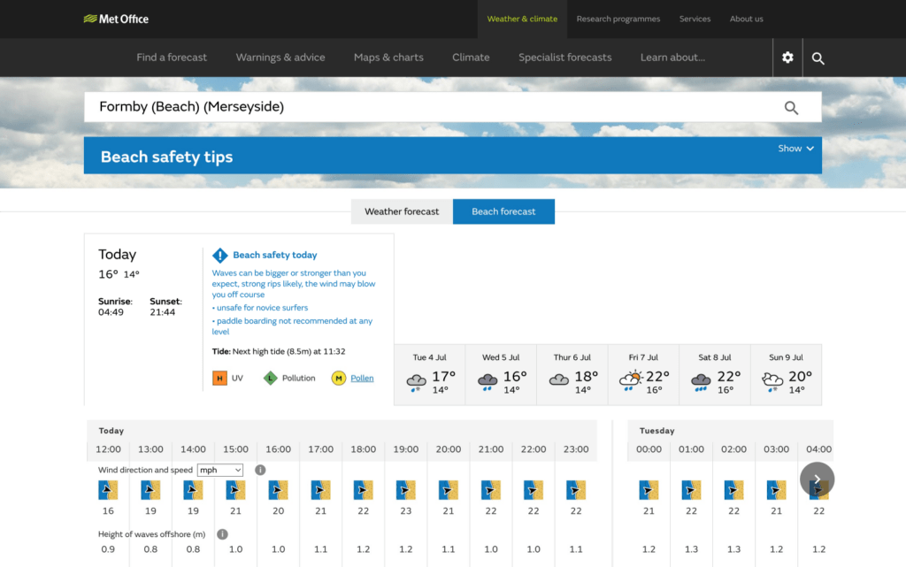
Our test results told us that the users noticed the safety messages more easily at the top of the page or between the search bar and beach safety tips. They understood that the messages were related to that particular day.
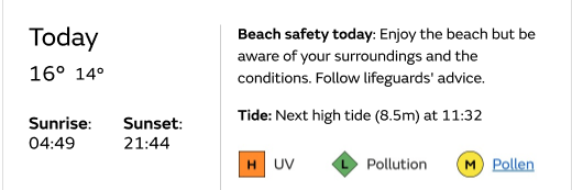
But if they looked at a different day, they didn’t scroll back up to see if the messages were different. So we decided that putting the safety messages in the forecast table, specifically the “Today” tab, was the best option. The “Today” tab is a section that gives some at-a-glance information about the day, such as sunrise and sunset times, highest and lowest temperatures, and things like UV exposure risk and air pollution levels.
Our testing also showed that using an icon for the alert level messages made the message stand out to users and told them that it was important. We knew that the Met Office already use icons to draw attention to weather warnings and that this works well. We wanted to follow that approach but make sure that we didn’t distract from, or cause confusion with existing weather warnings.
We chose a blue exclamation mark icon for the alert-level messages to help them stand out. We thought that this was different enough from the weather warning icons. This icon tested well, users recognised that it was an important message. They also knew that it was separate from weather warnings.
Refining the messages
We experimented with different ways of presenting the safety messages to see what worked better. We tried 2 approaches, which were:
- instruction-led – putting the instruction first and explaining it using the weather conditions
- weather-led – putting the weather conditions first and listing the instructions for the activities
Testing showed us that weather-led meant more to the users. This told us that they needed us to explain how the weather conditions affected safety. We also needed to consider that:
- we needed to give information, not absolute guarantees
- most incidents happen in mild conditions
- all scenarios carry some risks to be aware of
- we still want people to enjoy the beach
The early versions of the messages made reference to safety risks. This worked well for the higher-risk scenarios. Users were able to recognise that a higher-risk day would not be suitable. It was harder for them to recognise a good day for the beach with this approach. The mention of risk made the messages seem more scary than we had intended.
We were also aware of the risk of “alert blindness” by making the messages for lower-risk too strong. If users expected difficult conditions but found them to be acceptable, they might ignore warnings in future.
For the lower-risk scenarios, we tried using phrases like “enjoy the beach” and “be aware” to provide some balance to the descriptions of risks.
This helped to show when a scenario was a good day for the beach and still gave information about the weather conditions and the things to be aware of. It also stopped short of giving an absolute guarantee of safety. We still wanted the main message to be that people should speak to lifeguards about the local conditions on the day.
Other considerations
The Met Office have a system for categorising wind intensity at sea, called the Beaufort Scale. They used to use it to add a description of the wind in the beach forecast. When testing, we found that some of the wind descriptions would contradict the conditions in the scenarios. We felt that this could be confusing to users. For example, some people might think a “fresh breeze” is nothing to worry about. But on the Beaufort Scale, it is a high-risk wind (17-21 knots). We dropped the Beaufort wind description from the beach forecast to avoid such confusion.
What were the results?
Because we iterated the content several times based on user feedback, we were confident that we were meeting user needs. The beach safety messages were noticeable and understandable to users. The messages allowed users to understand how weather conditions affected the safety of activities that they enjoy, which made the weather data relatable to their own situation and experience.
Thanks to the expertise of the RNLI and the Met Office and the team’s hard work, the beach safety messages went live on the Met Office website this summer.
A pop-up survey was launched alongside the new beach safety messages to gauge users’ perceptions of the beach forecast and safety messages. The number of positive comments went up from 30% to 66% after the safety messages were launched, with many users praising the advice and how important it is. Examples of these comments include:
“This is a reliable feature and very welcome. I have recommended it to others in the sea swimming community.”
“Today was first time I had found this new Beach data alongside weather data. Brilliant addition to weather data source. This beach safety advice is excellent, but Met Office needs to publicise this add-on data.”
“We loved this feature on our holiday to Cornwall this year. It was really helpful, thank you!”
“This is an excellent addition to the weather, and I use it all the time for kayaking and swimming. Direction and height of the waves is good too, and I like the paddling summary which helps me decide if it’s safe to go……Nice work here!”
A big win for the Met Office and Made Tech!
The Team
User Researcher: Eleonora Costamagna
Interaction Designer: Tom Morgan
Content Designer: Jude Stockwell
Developers: Josh Gosling, Ahmad Vegah
About the Author
Jude Stockwell
Content Designer
Jude is a Content Designer who joined Made Tech through the Design and Research Academy. She is passionate about using good practice to design truly user-centred digital services.