Is there such a think as too much data?

About this event

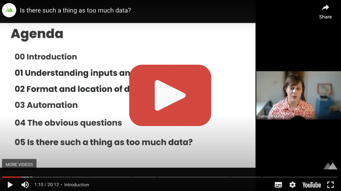
CATHERINE QUILLEY: I was chatting to a friend and the topic got on to work. He’s a very talented engineer working in transport. As we chatted, he mentioned that some of the machines he worked on produced too much data.

I started thinking about what he meant by that. After all, we live in an age where terabytes upon terabytes of data are generated every day in the form of text, video, pictures and so on. Threads, the new social media platform, generated ninety-five million posts in its first 24 hours of existence. That’s a lot of data, and let’s not forget that doesn’t include the metadata produced by its initial thirty million users.

So, with my professional hat on, I wanted to think about what my friend meant, and what other mean when they say or feel like they have too much data.

In this talk, I want to break down how we can approach this thought and statement, and the questions we might ask about it. By the end of the session, you will be armed with the vocabulary and knowledge needed to explore this concept of too much data, and how you can start to tackle this within your organisation.

If you are new to the data landscape, if you’re looking for a refresh or a summary, this webinar will be helpful for you.

First I want to take some time to introduce myself. I am Catherine Quilley, I am a Senior Data Engineer at Made Tech. My career thus far has been in organisations that have a lot of data and a lot of data problems to solve. Not only that, but in the past, I have been a Business Analyst as well as an Engineer. Which means I have the perspective of being an end user for a system as well as the provider of a system.

Let’s be clear, it’s absolutely fine to feel like you have too much data, and not be able to articulate further as to why. Technology moves fast, as do the challenges associated with it. What we may have done a few years ago may no longer be fit for purpose. The landscape has expanded so much that it can be tricky to know where to start with evolving our data platforms and pipelines.

When we use the term ‘data pipeline,’ we are referring to any process that takes raw data and processes it to allow querying or report generation. When we talk about data, there are many other concepts and terminology that often get folded into the conversation; streaming, relational versus object storage, structured versus unstructured, pipelines, machine learning, AI, the warehouse, the data lake, batch processing, catalogues, automation, meta data, the cloud. So, as technology shifts, as the ease of gathering data inevitably increases and adds to the volume and throughput, and what we can do with that data becomes deeper and more complex, it is understandable that it can feel too much.

Let’s unpack what might lead to an organisation expressing that statement, and the questions we might ask to understand and unpack that.

What are your data inputs and outputs? It’s great to understand what goes into the input and output of a system for a few reasons. Firstly, we want to get an idea of the width and depth of data inputs. By that I mean I want to find if you have one, few or many data sources. And for each one of those data sources, how much data is generated from those sources.

Let’s talk through a few examples. Let’s imagine a scenario where we have multiple data sources, all from different locations; databases, APIs, CSGs etc. Let’s say we have 10, 20, 30 or a hundred of these inputs and outputs. Without looking at specifics, it is understandable that we might feel that this is a lot. After all, for each data source we need to consider questions like how often is it updated, what size is it, who uses it and why, what is that data made up of? How do we consume or get this data? What things and people depend on this data? Is there anything in the data we need to be mindful of, like personally identifiable information or other sensitive information?

If you have no immediate visibility on this, or information is incomplete or stored in multiple places; Wiki pages, documents, people’s heads, it’s really tough to keep track of, and instantly becomes overwhelming. It also erodes trust in data. If an analyst or data scientist has to generate a report from this data, how can they trust the output if there is a lack of clarity on some of the questions we raised?

In this scenario, a single point of visibility and traceability makes a lot of sense. This is where a data catalogue is likely to come in handy. A data catalogue is a tool that allows us to answer the how, what, when and where of data. It is a single, central repository of meta data. Meta data being information about your data, like where it is from and when you received it. This could be added, edited, updated manually or automatically.

It will also help you map relationships between data, letting you see samples of the data, and therefore you will understand the consequences of changes to your system, upstream and downstream of a particular data source that you are looking at.

It can also provide links to your existing knowledge base.

So, even before any changes to a system are made, you can have a really useful overview of your data landscape. Often that can be visualised with graphs or other visuals, therefore being an excellent way to foster discussion in your organisation about your data landscape without requiring much in-depth knowledge.

If you have a data system that feels T-shaped, or may X-shaped, with lots of inputs and outputs, and meta data about those outputs is not stored in a single place and visualised in a way that is accessible, it can feel too much. But as we can see, data cataloguing can be a really useful way to break our data landscape into manageable pieces.

Let’s look at another scenario. We might come across data landscapes where we have a few inputs, but those inputs are high in volume. This might mean a table with lots of columns. It could also allude to a large amount of data, or data via things like streaming, where data is sent continuously rather than being processed in batches.

Again, data cataloguing is useful, but for this kind of data, sometimes we want to look in a bit more depth, understand the shape of that data a bit better, and understand how that might change over time.

In this scenario, data profiling can be a useful tool. When we profile data, we collect information on it like examples of values, and basic statistical information. For numeric fields, we might collect mean, standard deviation, and account of null values.

In combination with profiling and cataloguing, we often want a way to let us look at data and be curious about it. If we don’t have the right tools or processes, that can be really difficult. Lacking visibility on data can make management of data feel really difficult. If it takes people a long time to accrue data, or the process is complex, or the barrier to entry is high, it is off-putting. Your data remains opaque, and you are not getting the best out of it.

In combination with data cataloguing and profiling, we need a way that we can easily look at data without having to think too hard about what format that data is in. Ideally, we want to be able to query our data in a syntax that many people are familiar with.

We can achieve this in a few ways. We could write scripts that run on schedule to provide a summary of information and some profiling. This lacks flexibility, and takes power away from the users and SMEs, who should have the freedom to explore their data, and not need coding experience to do so.

Here is where the power of the cloud comes in. As well as being competitively priced, allowing you to scale and store data without worrying about hardware maintenance, the main cloud providers have established tools to allow you to query your data with SQL like syntax. That being AWS Athena, GPP Query or Azure HD Insight. These tools let you query unstructured and structured data in the same way. Usually, they don’t care about the format of that data. CSV, Parquet, Jason – you can use the same syntax to get information from that data. This is great, as often raw data can be unstructured. Then as we process data, it often becomes structured. So, these tools can be a nice x-ray of your data, so you can have a look at it through all stages of processing.

When we make things visible, when we can create views or visualisations of data, we once again have a way of consuming, observing, and understanding a data system in chunks. These tools mostly rely on storing your data in the cloud. This leads on to our next set of questions.

What format is your data in, and where is it? When we talk about too much data, sometimes there can be too much for your system or use cases. By that I mean the method of storing data and where it is stored can have an impact, and can cause slow run times, crashing and so on.

You might have a process that will spend six hours churning through data, only to crash or fail because you’ve run out of memory.

The format of our data is important. There may be use cases where changing or readjusting that format makes sense and will optimise your data system.

A common scenario here is looking into whether your data should be stored using a row-based storage format like CSV, or a column-based storage format like Parquet. CSVs can be slower to query and take up more space. So, if space or budget is limited, CSVs are not always the best option. On the other hand, CSVs are very easy to edit by hand. People are very familiar with them; they are perfect for small data sets and perfect for manual testing. Parquet takes up less space for the same amount of data. It allows for easier compression and optimises your data for certain kinds of analysis. Therefore, for certain business use cases, it is much quicker for you to query your data if it is in Parquet format.

We can think of this in terms of how you might organise objects in a chest of drawers. In a CSV, each drawer would contain a row of data. This might be multiple objects: a pair of socks, an apple, a copy of your favourite book. Another drawer might have a jacket, banana, another book and so on.

When we store in Parquet, we store each column in its own drawer, and keep a record of where and which drawer that is. So, one drawer would contain clothing, one would contain fruit, and the other would contain books. It’s much easier to work out, for example, how many books you have, if your data is stored in that Parquet format. Instead of opening each drawer and counting the books in there, you open one drawer.

Most forms of data formatting are valid, that’s really important to say. How you use that data and its volume, will likely influence the format that data needs to take to meet your business use case. When you find the best format for your data, it becomes easier to view and query. Once again, what might have previously been too much for your system, is now no longer too much at all.

Where matters too and can be a more complicated question to answer. Going back to our discussion about space, cloud storage is the obvious solution. You can scale up and down your storage needs because you are not responsible for the hardware. Yes, this has a cost, but it is minimal, and it can be limited and controlled. There are also options to help you choose the best price for storage, like how often you access the data, where in the world you need to store that data and how you want to back that data up.

If there is a real requirement that sensitive data should be kept away from the cloud but you still want to utilise the computational power easily leveraged from the cloud for aspects of processing, this is what we would call a hybrid solution.

Given that we have found a suitable format and storage solution for your data, we also need to ask where queries and processes get run from. Running a query on your laptop or local PC limits you to the technical specifications of that machine. Running your queries using a cloud solution, you can balance cost and power to provide optimal performance for your queries. What could take a large amount of time on your machine could take a fraction of the time when you run that query on the cloud.

The best part of using the cloud is that you can borrow computational power when you need it, and give it back when you don’t need it, allowing you to respond to change and business need flexibly and cheaply. Do you need to run a query on lots of data once a quarter to create a budgeting report, but the rest of the year there is no need for that? No problem.

This brings us to a key point, and our next question. Sometimes when we find data too much, it is sometimes not the data itself, but the overheads associated with it. All pipelines need maintenance. A good data pipeline should be a balance between allowing maximum control over your data, and minimising overheads like code and hardware maintenance. But often, the biggest cause of data feeling too much can be a high level of manual intervention, so it’s good to know how much is automated.

Let’s say you have a report that takes ten CSVs. It is entirely possible that you have automated it as much as feels possible. Perhaps there is a script or a well-documented process. The fact of the matter is that if someone has to manually trigger that process, or repeat the same actions to produce the desired output, or as the process runs you can’t see logs or feedback on the process, it removes headspace that could be going towards other parts of the working day, and data analysis.

Automation is our friend. A key aspect of having data we feel in control over is well thought out orchestration. When we orchestrate a data pipeline, we use a framework to describe in code the steps we want to take to process data automatically. For example, taking our CSVs, converting them to Parquet, storing them for querying and creating a report that gets emailed out to end users.

When we automate and schedule these tasks, we can reduce the need for us to carry out repetitive tasks, and even expand the scope of our data processing, as we are no longer creating a bottleneck for ourselves in the form of high manual intervention.

These steps would be coded into the pipeline, and therefore if overnight ten CSV files became twenty, code could be changed and the solution could scale with relative ease.

By this point, you may also be pondering the questions I haven’t asked you, like: What do you want to get from your data? Or, how do you know if your data is good quality or not? Undoubtably very good questions. I am sure you are familiar with logging into your favourite streaming service and facing decision paralysis in the face of an endless amount of choice, where you aren’t clear if today is a movie night, a documentary night or a reality TV binge.

Thinking along the lines of TV watching, how do we know if a TV series is good quality if we haven’t read the reviews or asked our friends about it before watching it? Why haven’t I asked you about data quality yet?

Well, there is a human element here. If we feel like we have too much data, we can’t always answer questions like what we want from our data, and is it good quality. If we felt able to answer those questions, it’s likely we feel like we have control and oversight over our data.

Sometimes, too much can feel like we can’t answer those questions or make those assessments. These are questions that absolutely need to be asked, but not until the users feel like they have a handle on the data. We can only get a sense of that by applying some of the tools and processes we described in previous slides.
Perhaps some of this sounds quite technical. It’s worth remembering that managing large datasets is not a new problem, even if the phenomenal scale of data is relatively new. There are options to help create pipelines with less or more code – configurable solutions that can be looked at that might cost more, but could provide a shorter iteration, letting you get a data output more quickly.

Of course, it is a collaborative process, so there would be plenty of opportunities for upskilling, as well.

So, is there such a thing as too much data? From a perspective of processing, understanding and analysing, no. Often the perception of too much can come from a need to change how we look at our data, the need to make changes but being unsure where to start, and changing our thoughts around automation and processing data.

It doesn’t actually have much to do with the volume or quantity of data. It can also come from understanding that there is a problem, but not being able to quite identify where that problem or problems are. In some cases, organisations might not feel able to begin to tackle the problem.

Too much data can look like a lack of a centralised picture of data sources and relationships between data sources, and a lack of tools to allow us to profile data and get a sense of its shape. A lack of tools to query data and actually look at it, or the barrier to querying it being too high. Data being stored in formats that don’t match the use case, infrastructure not being optimal for the volume of data or querying needs, and too much emphasis on asking questions that maybe we just can’t answer yet.

Data doesn’t feel too much when it produces clear outputs and outputs to our questions that we can trust, trace and understand. Be that the output of a machine learning algorithm that crunches through terabytes of data, a dashboard, or simply the ability to query data with ease. Therefore, it doesn’t really have much to do with volume, complexity, or quantity, but really how much of it we feel we can see, interrogate, and understand.

It doesn’t really matter if a data landscape feels overwhelming with just a few inputs or many inputs. It doesn’t matter if your pipeline processes megabytes or terabytes of data. It doesn’t matter if your pipeline is one entirely run manually, or partially automated. If ultimately it feels too much, that’s valid, and indicates a good business case to ask questions about your data process and add improvements.

If you want to find out more about the projects that Made Tech have done, you can visit our website, where we have written up detailed case studies of how we have solved problems in the public sector. You can also contact our marketing team, who would be happy to give you some more information.

I want to thank you for taking the time to listen to this webinar and have a lovely day.

Having a wealth of data can seem overwhelming – especially when you don’t know where to begin, and the wide range of data platforms and tools available.

In this talk, Catherine will share how to break down data to make it useful, insightful and accessible. She’ll also explore challenges in managing and harnessing the power of data, including data platforms, sources, catalogues, formats and storage.


There’s a lot of public-sector knowledge about data locked away inside different organisations. And much like data itself, we want to open it up. This webinar is part of The Pipeline, a collection of talks by our data community breaking down data concepts, exploring data challenges and sharing the lessons we’ve learned from our years in the public sector.

Got a tricky data question you’re struggling to find the answer to? Tune in as Catherine and other speakers from our the Pipeline answer questions to your top data questions.

Date

Wednesday, 8 November 2023
Speakers

Catherine Quilley

Senior Data Engineer at Made Tech

Catherine is a Senior Data Engineer with project experience that spans Finance as well as the Public Sector. Arriving at Engineering via Business Analysis she is keen to make use of her experience as a builder, analyser and user of data systems. She is motivated by educating, upskilling and creating solutions that empower users, giving them control and visibility over their data.

Read more about Data and AI

Think your sector has data issues? You’re not alone

Think your industry’s data challenges are unique? Think again. Explore how data-driven insights and AI transformation are revolutionising sectors like healthcare, energy, and public safety.

Read more

Top 3 ways to address the challenges and demands in public safety services

How can public safety agencies exploit the power of data and technology? James West explores how to tackle ‘numb pain’ and advocates keeping things simple.

Read more